Last week I wrote a post about my idiocy in setting an autonomous AI agent to the task of documenting my system for a new team member and for client-facing and sales work. Then I got busy doing other things and did not check in on the agent for a week.
For a week, every hour on the hour, my AI employee diligently worked on creating amazing documentation for me, unattended.
And—OMG—it was awful, horrible, very bad, useless.
I know AI can produce amazing documentation, so I had my Chief of Staff AI debug and fix the process. I now have amazing documentation, but I did not use the autonomous AI to do the work. It is a great tool, but it is not the right tool for every job. After I get through all the documentation, I will redeploy it with the mission of keeping the documentation up to date.
Today’s “Just Give It to AI” is about improving the look and feel of graphs.
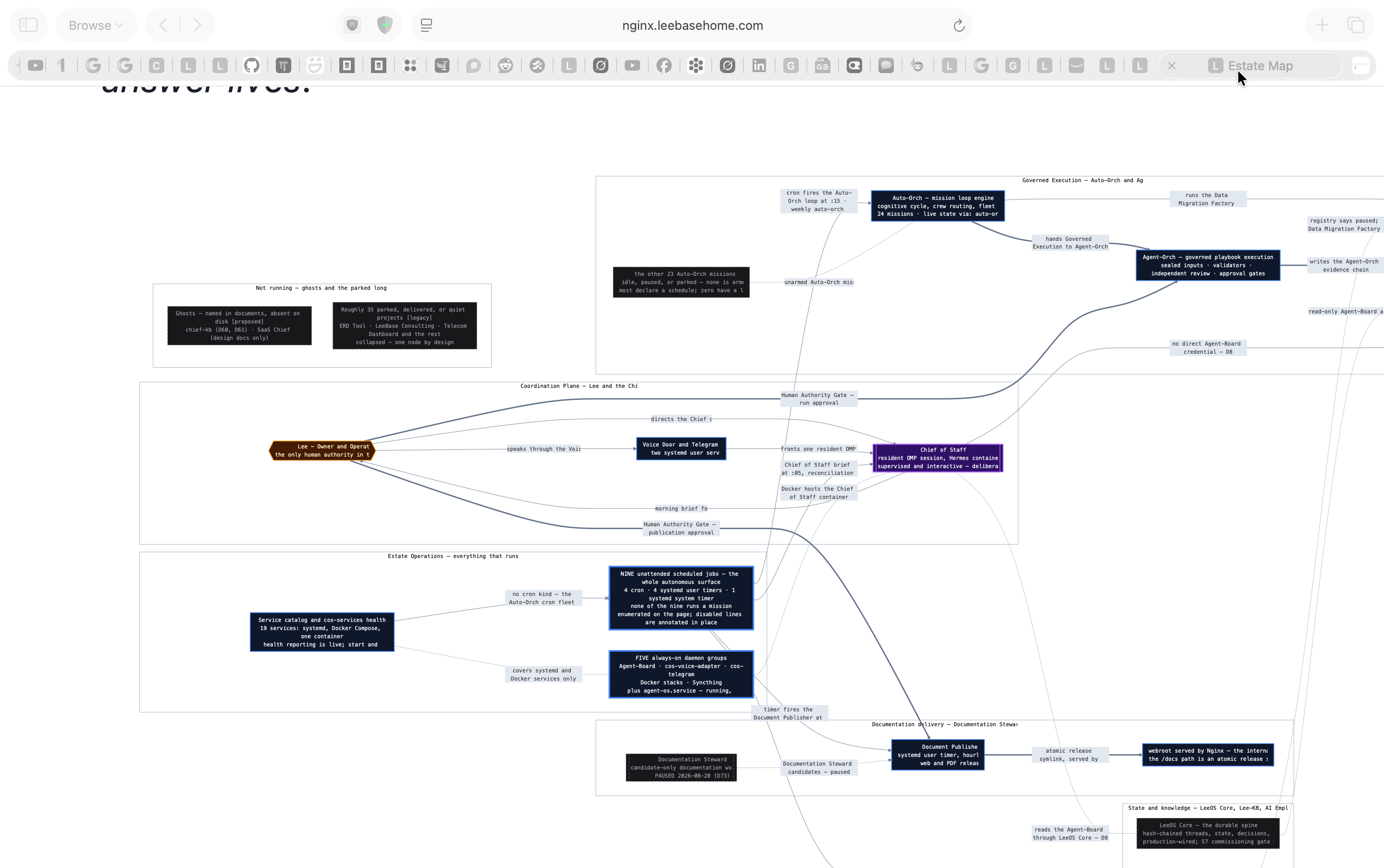
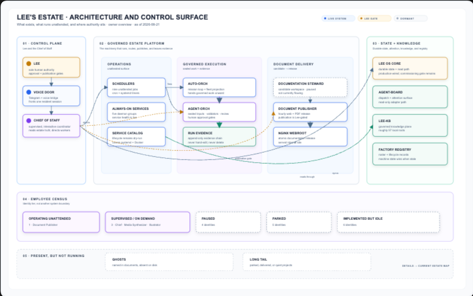
I was happy that the new documentation effort created graphs to illustrate concepts. They just were not visually attractive. I was in a Zoom meeting and noticed how attractive someone else’s charts were—and they were also AI created. I took a screenshot and gave Codex the before and a desired after.
It took a couple of rounds with Codex to hone in on the look and feel, but eventually it nailed it. Then I upgraded my graph-generating AI employee and had it go through and deploy the improved style across the existing documentation.
Before and after is a powerful technique to use with AI. “Make prettier charts” does not quite cut it. Take chart A and make it look like chart B in style—much more effective.
Before
After
The lesson is not that AI cannot design. It is that vague directions produce vague results. When you can show the system what “good” looks like, the visual conversation gets much more precise—and the next iteration gets much better.